Create A Map Using FileMaker I

Today I was asked to create a map using FileMaker to show all the students that are accepted to my client’s school. The client said the Department of Education needs to map out the bus routed for the students. He said he DOE may not want to provide buses for a child if he/she lives too far, and we need to make an argument that the child should be bused to the school.”

So at first I thought about what software/plug-in I should use, then I realized I can create a map with Google Maps with layers. Especially, since this map we can’t just have in the database but rather we need to share it with the DOE. Turns out this was the easiest task, ever, so I thought I’d share the steps.

  1. Export the data you want to be mapped in CSV format. I wanted to see kids and their location (full name, address, city, zip);
  2. Create a Google Map here: https://www.google.com/maps/d/u/0/;
  3. Add a new layer, name it whatever you want to import your data into;
  4. Import the CSV file. It will ask you to dedicate the data for the pins (address) and the next step is to dedicate a column for your label (full name);
  5. Change the color of the pins;
  6. Add more layers with more data if needed (in my case my school is the other layer).

And here is the finished product:


Screen Shot 2015-07-15 at 1.12.44 PM

Getting Data From WordPress To FileMaker II

In my previous post, Getting Data from a WordPress to FileMaker I detailed how you can get mySQL data (that perhaps comes from a WordPress form submission) into FileMaker.


This time I’ll write about how you get that data into your own FileMaker table.


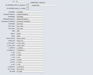
I recommend “importing” the data from the mySQL database into a temporary table. We called ours APPLICANTI_TEMP.  It contains the same exact fields as the mySQL database and it is there so you can identify records in between the two tables. So in my case the fields are text fields, just like in the mySQL DB (even the timestamp). But then we added a timestamp field that is a regular FileMaker TimeStamp and when we run the scripts we set this with the proper FM TimeStamp.


I added two calculations:

  1. One that checks whether the record we are viewing exists in the mySQL table and
  2. Another one that checks whether we have added the record to our APPLICANT table.


Screen Shot 2015-04-15 at 6.45.02 PM


These calculations are quite limited but in my case achieve the wanted result. I am not too worried about someone modifying the records in the mySQL table, because I’m the only one with access to it. But you’ll have to make decisions based on what’s best for you. I, however wanted to make sure I’m not creating the same record several times in the APPLICANT table. Well, we still are, because people apparently fill out and submit the form (sometimes with mismatched information?!?) several times. So at the end of the day you’ll still need a human to identify if a second record has a misspelled last name or it is, indeed a different applicant. But in case you have a scenario that disallows record deletion based on some criteria, you’ll need to develop a more refined logic.


I have already converted my SQL TimeStamp to a FileMaker readable timestamp, but if you don’t do that in your Query you’ll have to do that in FileMaker. Bring Dunning’s Custom Functions collections is always a good place to start looking for handy custom functions.


Screen Shot 2015-04-15 at 7.07.08 PM


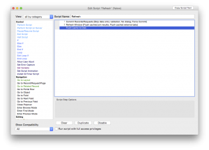
We have a set of scripts that perform the data move (because it’s not really an import). They loop through a set of fields on a layout record by record and create the record in the TEMP table, then the APPLICANT table. These scripts are run from the server every 15 minutes. You set your time interval based on your own process.


The first step is to refresh the data from the mySQL database, because unless you do that any new submissions from the web (in my case) will now show in FileMaker:


Screen Shot 2015-04-15 at 7.10.51 PM


Before running scripts from the server, always make sure you test the hell out of them locally first. Here’s an article on server-side scripts in general. I always recommend adding a LOG table, and put in error checking in your scripts, especially when you’re running them from the server. You DO NOT have a debugger on server. And who wants to code blindly?!


And if you’re lucky—like us—you’ll have to parse the data into different tables, because you’re dealing with parents, addresses and phone numbers. You’d obviously want to do that from the TEMP table record.

Hope this covers it all. Any questions, feel free to ask.

Getting Data From WordPress To FileMaker

How many times we find ourselves presented with a new challenge when working in FileMaker? I will say this: more often than not. I like challenges. They make you learn and keep you on your toes.

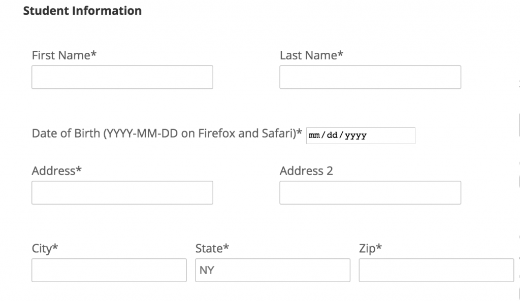
My client has a website for a new school which we built in WordPress: www.yalowcharter.org. He was interested in getting data from WordPress to FileMaker. The school is accepting applications for students. He needs the applications to be in a FileMaker database so we can keep their information (children names, parents, etc.)
Screen Shot 2015-02-26 at 11.18.51 AM

I’m using the ContactForm7 plug-in to collect the information. Visitors can fill out the form and submit the info. The great thing is the plug-in works well, it even has a CAPTCHA element (separate plug-in required) so you won’t get spammed by bots. It however can only email the data from the form collecting all the  data and dumping in the body of the email. That is as far from a relational database as it can be.

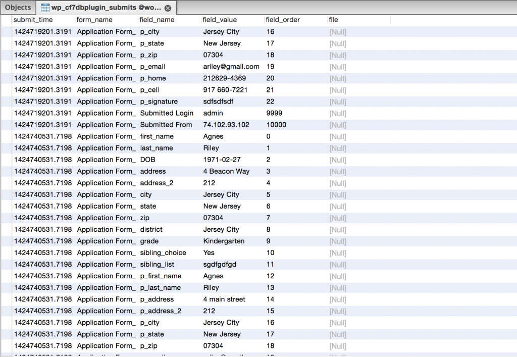
So after a little digging I found another plug-in (Contact Form DB) that can dump the collected data into a MySQL database. I was excited like a little kid. Then came the next hurdle: all the fields with their data created a new record. And the MySQL timestamp, of course is not oh so delightful. By the way, I use Navicat for working with SQL tables, but you can use PHPmySQL, and that will do the job, as well.
Screen Shot 2015-02-25 at 11.38.06 AM

Turns out all I had to do is write a SQL query to turn that into a nice VIEW and now I have columns and rows with a properly formatted timestamp. So here’s one query that can help you write one:

SELECT
DATE_FORMAT(FROM_UNIXTIME(submit_time), ‘%b %e, %Y %l:%i %p’) AS Submitted,
MAX(IF(field_name=’first_name’, field_value, NULL )) AS ‘first_name’,
MAX(IF(field_name=’last_name’, field_value, NULL )) AS ‘last_name’,
MAX(IF(field_name=’email’, field_value, NULL )) AS ’email’,
MAX(IF(field_name=’cell’, field_value, NULL )) AS ‘cell’,
MAX(IF(field_name=’website’, field_value, NULL )) AS ‘website’,
MAX(IF(field_name=’service_provided’, field_value, NULL )) AS ‘service_provided’,
MAX(IF(field_name=’address1′, field_value, NULL )) AS ‘address1’,
MAX(IF(field_name=’adress2’, field_value, NULL )) AS ‘address2′,
MAX(IF(field_name=’city’, field_value, NULL )) AS ‘city’,
MAX(IF(field_name=’state’, field_value, NULL )) AS ‘state’,
MAX(IF(field_name=’zip’, field_value, NULL )) AS ‘zip’
FROM wp_cf7dbplugin_submits
WHERE
form_name = ‘Individual Membership Form’
AND
form_name = ‘Student Membership Form’
GROUP BY submit_time
ORDER BY submit_time DESC

And that produces something like this. If you have errors Navicat will let you know.

Note: Make sure you use straight quotes, aka not curly (or smart) quotes such as the ones text editors use.

Screen Shot 2015-02-25 at 11.38.39 AM

The next step is using the Actualtech plug-in (ODBC connector) on the FM server to set up a DSN so you can access this data. You’ll have to define your database (tables, view, username and password).

Note: Make sure you select “view”, as well because it is not an actual table you need but the view you created with the SQL query.

After that you create a new external data source in your FileMaker database and create your table occurrence from it.
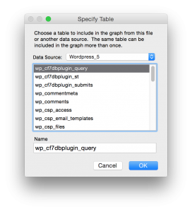
Screen Shot 2015-03-03 at 4.33.45 PM

You can actually just display this data in your database but it’s much more sophisticated and safer to bring that data over to FileMaker. Of course you can do this in different ways. I have to parse the data into multiple tables because we are dealing with related data (kids to parents, phone numbers to parents). I will just run a server script that will check for new records and create them on the FileMaker side when new records show up.

One last important thing to pay attention to is that just because a form is submitted and a record is created in the MySQL database the record will not show up automatically in the FileMaker database. So you’ll have to refresh.

Now, of course when you’re dealing with data you’ll have to put in some checks and balances. Data can be submitted twice because of computer or human error into the MySQL database but we don’t need that twice in our FileMaker database.

I think this is a pretty simple and easy way to get data into FileMaker from a WordPress site.

Update: We’ve published a follow-up article, you can read here:

FileMaker on Android and Web

A lot of people ask: can we run FileMaker on Android?

Well, not natively, but that doesn’t mean you cannot get access to FileMaker data.

I’m going to list a few options. Of course, you can always run down to your local Apple Store and grab an iPad Mini and then all your problems will be solved. Plus you get to use Messages and talk to all your iPhone owner friends for free. If this doesn’t tickle your fancy, here are your options:

Option 1: Set up a 2X Server. I know just the guy for that. Then you can access your database (or someone else’s) through a Windows and a real FileMaker Pro install. Will it be readable? Well, that depends on your screen size. We tested this on an Android Asus tablet some time ago. See the video:


Option 2: Have a web developer (e.g. us) create a web application that gets your data posted from FM to the web and load that in a browser. We can even sync your data with MirrorSync from 360works.com.

Option 3: Upgrade to FileMaker 13 and use WebDirect to show your data in a browser. Now, I know what you’re thinking. This product is brand new. Is it buggy? Well, it might need more beefier web server than what you might have at the moment and being new we will discover bugs as we use it, but it’s a viable option.

But then again choosing the right option is choosing the right city to raise your kids in: requires some research and conversation.

Contact us if you need help deciding or setting things up. We’re here to help you.

FileMaker Go and Barcode Scanning – A Workaround

We all know that there are differences when dealing with FileMaker Go vs. FileMaker on a desktop. I think I can speak for all of us when I say we’re grateful that FileMaker Go exists, but we have to admit it has caveats. But we’re resourceful developers, right? We will sit and try ti tackle any given problem, because that’s what out clients/bosses pay us for. Most importantly, we cannot sleep until we figure the issues out because it just bothers us when we’re presented with a problem that we cannot find a solution for.

We sell barcode scanners. We make sure all of our scanners work with FileMaker, and all of our Bluetooth scanners work with FileMaker Go (and, of course, Android and other devices that sport Bluetooth connectivity). So far so good, right?

I’ve been getting complains that it’s impossible to scan into FileMaker Go. When things dont work like they’re supposed to out of the box.

The Problem

In FileMaker Pro you can script the scanning process to show a dialog that you scan into. This is great, because all the scanners you can program (which is usually the default anyway) to send a carriage return (enter) at the end of scanning. Which means that when the scanner is done scanning your code, the “Ok” button will be pressed automatically and your script can continue what it’s supposed to do, whether that is the bring up the dialog to scan another code or do some crazy magic and analyze data. You, however cannot achieve the same result in FileMaker Go, because you cannot get the cursor into the dialog. Now, we can ask questions like ‘why’ and spend hours and days cracking our heads open and even email FileMaker Inc. to see why this is not working. Or we can simply create a workaround.

The Solution

You can download a simple file that demonstrates how you can get around the problem with barcode scanning in FileMaker Go. I used a field to scan into instead of the dialogue and two triggers so you can create records and keep on scanning. There’s one field and one button on this layout. Obviously, you will have to scrip the rest of your process.

We can take the load off of you by doing the heavy lifting. Scripting can be cumbersome, when all you want to do is just scan an item and manage your inventory. Let us help.

We sell a wide selection of Bluetooth Laser Barcode Scanners that work with FileMaker Go out of the box . Pair, connect and scan right into a field. Want to use the iOS keyboard? No problem, push the small button and the keyboard will pop up.

Converting Files to FileMaker Pro 12

As you may know by now FileMaker 12 is out. A lot of articles have been written about the various features, so I’m not going to bore you with that. FileMaker 12 for iOS is free, so if you haven’t grabbed a copy, go get it. It comes with some demo files to play with to learn about the new features.

With every new release the question comes up: should I wait or should I convert? I think this question should be answered separately whether you’re a developer or a user. Users tend to jump in a lot faster. I have users who just announced they converted their database. Once it’s done—and you start using the database— it’s hard to go back. Developers I talked to are wary about converting, so we have two different groups with one goal: data integrity, however, their patience levels are different.

FileMaker Pro 12 can directly convert your existing FileMaker Pro 11, 10, 9, 8 and 7 databases.  All other versions of FileMaker Pro will require a multiple product conversion.  Review the information below to determine whether your files will directly convert to FileMaker Pro 12, or if they will need to be converted multiple times.

More info can be found in the FileMaker KnowledgeBase.

So, before jumping in, let’s look at a couple of things.

If You Are A User

First and foremost discuss the conversion process with your developer, if you have one. It’s a new file format, you’ll need to upgrade the server, as well as the file(s). If you don’t have a developer, take a look at your dataset. I heard complaints about issues with scrolling in list view. This may not affect you if you don’t use list view, but it’s worth knowing. I, for one, never use list view in the solutions I develop. I use portals that can be filtered in many ways instead, so you don’t have to work with large sets of data at any given time.

Take a moment to consider how mission-critical your solution is. If you’re a small shop (couple of people) with a one-file solution you may be able to just jump in and bite the bullet. You may never have any issues. And you may love a lot of the new features FileMaker 12 offers including the new layout themes. I’d still make a copy of the new database and run FileMaker 12 parallel to your FileMaker 11 (yes you can) and test the new database for a good couple of days. Run scripts, create records, check the mission-critical processes.

If you’re a larger shop or your database is mission critical, I’d take a copy of the file, convert it, put it in a test environment. Put in on a new server (different machine than your FileMaker 11 server). Test your new database thoroughly for about a week. Test systematically. Test for as many processes you can.

If You Are A Developer

Then it is your duty and responsibility to manage client expectations and not let them commit suicide. The same applies to you as the large shops who have a test environment and can perform lots of tests. But you also need to consider that FieMaker 12 has changes that affect the developer, as well. One example the new layout tools. Test the development features, as well, to make sure you will be comfortable developing on the new version.

We’ve been waiting awhile for FileMaker 12 and we are all excited. I love the new Insert from URL function, for example, but  when I developed a database for the iPad for a client, I noticed that getting XML takes 5 minutes on an iPad2 in FileMaker 12. This is not a concern for my client, I believe, but it can be a concern for more mission-critical environments.

It’s possibly best to convert, while your users are not using the database. A weekend might be a good time if you can’t set up a test environment. But as you know, we have 4 weekends in a month, so don’t schedule more conversions than you can handle.

Talk to us, if you need help converting your FileMaker files or have questions about development.

Trojan On Macs – What To Do

I wish I could write about FileMaker 12 (which I will, soon) but there’s a more eminent issue right now: there’s apparently a new trojan out there attacking our Macs. When I read something like this, I generally just ignore it (because I have not seen a virus, malware or trojan  for Mac OS X), but I have done my research and it seems several large websites picked it up, such as Gizmodo and PC Magazine, so it would be unwise to just ignore it. According to sources, 600,000 Macs have been affected. That’s a large number to ignore. Read below, check and fix if you have it.

No worries, F-Secure has a fix for the problem.

Gizmodo has a method to check your computer; you can find it here.

I ran their check and I’m clean:

new-host-3:~ ariley$ defaults read /Applications/Safari.app/Contents/Info LSEnvironment
2012-04-05 11:39:23.355 defaults[24956:707]
The domain/default pair of (/Applications/Safari.app/Contents/Info, LSEnvironment) does not exist
new-host-3:~ ariley$ defaults read ~/.MacOSX/environment DYLD_INSERT_LIBRARIES
2012-04-05 11:39:41.692 defaults[24958:707]
The domain/default pair of (/Users/ariley/.MacOSX/environment, DYLD_INSERT_LIBRARIES) does not exist

The check is easy; all you have to do is issue two commands in the Terminal. I highly recommend that you do it.

Also, install the Java upgrade Apple just released. Go to Software Update under the black Apple in the upper left corner and check for updates; it will show up.

Differences Between FileMaker And Excel

Everyone I know is familiar with Microsoft Excel to some extent. Some people are more well-versed than others and can do complex data management. Not long ago I met with a consulting company who is working with one of the largest companies in the country to install hardware nation-wide.

The original process is so cumbersome that they now have a lot of things fall through the crack. By the time an order goes through the myriads of departments and processes, the requirements change and the parts required, as well. But the warehouse doesn’t know how to handle that. So they called in a consultant to help. The consultant doesn’t know FileMaker, so they created a giant web of Excel sheets that actually do a really nice job at filling in the gaps and getting the orders straightened out. FileMaker could’ve given them reports and live dashboard so they can see which orders have mismatched elements or which orders need to be fulfilled in the near future. But at this point they invested quite a lot in Excel, so I doubt they will have the time and energy to redo it in FileMaker.

To those who have not put too much effort into Excel or finding it cumbersome to manage their day-to-day activities, the below will give some incentives to use FileMaker instead of Excel to manage contacts, products, inventory, documents, and events. Contact us if you need help deciding. Learn more about FileMaker development.

Strengths of a spreadsheet

  • Storing and analyzing data in lists
  • Analyzing and modeling data
  • Producing charts and graphs
  • Building a financial model
  • Creating basic reports
  • Controlling who can open or modify a file

Strengths of a FileMaker database

  • Viewing information in list, form, or table view
  • Storing and managing virtually any type of information (words, images, numbers, files and more)
  • Creating and publishing customized forms and reports
  • Connecting related information such as inventory and sales
  • Connecting to and from websites
  • Access by multiple people at the same time
  • Mobile access through FileMaker Go or web
  • Set up recurring imports from Excel

Tip:

Use FileMaker to normalize data headers in Excel. This past weekend I was working on my new web store (ssh!) and I had to export/import products. When importing into the new system I encountered an error: “data headers are duplicated”. Well, I looked through the header row in Excel and I couldn’t see anything duplicated, but when you have a lot of columns you shouldn’t rely on your eyes. I did a quick web search and I couldn’t find an easy method to figure this out. Then I realized, why not use FileMaker? So, I quickly converted my Excel sheet to a FileMaker database (drag and drop) and I had all the fields and data in FileMaker. Clearly, FileMaker didn’t have an issue with the fields, so there was no duplication; the web app lied. So, even though I was back to square one, I figured the web app might not like the file format of the CSV file I was trying to import. So I converted it to another format (Windows of all things) and the import went through just fine. Moral of the story: I could’ve spent more time trying to figure out  how to get rid of the non-existent duplicated headers in Excel. But instead, I called FileMaker to the rescue, and it solved my problem in 2 seconds.


UI Design – 10 Tips For Excellent UI Design (And Not Just for FileMaker!)

We can all agree on one thing: Apple knows design. The reason why Apple’s design is excellent is because it’s minimalistic and draws the users’ eyes to what needs to be seen and hides the rest.

A perfect example is the aluminum keyboard:

  • size: as small as physically possible for average fingers to type on;
  • key height: as shallow as possible for a good rebound effect;
  • the USB ports are hidden under the keyboard.

Follow the Universe. The stop sign is a universal symbol. Can you imagine if NYC decided to swap them out in hot pink and the shape of a triangle? You’d have cars piled up at every intersection. Of course, in a database we cannot cause traffic accidents, yet still it is important to pay attention to some design principles.

Quality itself is not enough. Some cultures have always paid attention to design and some took awhile to catch up. I remember how I hated the the style of the former Soviet Union while growing up in socialist Hungary. Every product that entered our country from them was large, boxy and durable, but hard on the eyes and hands. On the other hand, leave it to the Danish or the Swedes and you are guaranteed your product will be carefully designed.

“Even though design is not the most important thing, at the end of the day we are looking at this thing all day long,” said a possible client to me about their current design.

A good designer always looks at the interface from the user’s standpoint, not their own. It is always easier to slap on two more buttons, pick a color quickly and be done. But will those buttons fit in your theme? Do you have a theme at all? Web development has changed drastically over the last decade. Barely anyone uses Flash anymore, and people realized that you don’t need to have every color on the horizon on one screen. FileMaker shouldn’t be any different. A database, actually, gets a lot more screen time than any website, so it really should be paid attention to.

I just was faced with the UI below and even though I’m a designer/developer, I couldn’t figure out how to use this service. My initial thought was I must be stupid and/or getting old. Then it hit me that this experience is not my fault. A good interface is about not having to write a lengthy manual just to find the start button.

I’d like to give some pointers to new and old developers alike on some key details to pay attention to. Your users will thank you for it.

Design your theme

Don’t just start plunking elements on a layout. Or even if you had to do that last week (because your boss put a gun against your head and said you will have to put 23 more buttons there), take some time this week and visualize your user interface. Think about why the user needs to be there in the first place and what they need to see. Resourcehttps://kuler.adobe.com or https://filemakerthemes.com. Kuler even has an option to upload your image (client logo, brochure) and build your color theme from it.

Design for the appropriate screen size/resolution

Ask your client: what screen sizes/resolutions do you have? Are you on Mac or Windows or both? If you have a mixed screen environment, you have to design for the smallest screen, and extend everything from there. You can always extend white space, but if you start too large, they will have to scroll left and right or up and down to see their data.

Be minimalistic

Show interface controls on demand. If there is something you can hide, hide it. The user can always get to it later. If you overwhelm them, they will feel like a kid lost at Grand Central Station. There are plug-ins you can use for this. Resourcehttps://filemaker-plugins.com.

Minimize travel time

Isn’t it great that we have www.hopstop.com now with so many cities that we can choose routes with fewer transfers? Try to think of a way to get your users from point A to B in the least amount of time. Try to get as much information into one dialog as you can so they can choose what they need and move on.

Don’t abuse color

Choose 2-3 colors that complement each other. When in doubt, it’s always a good idea to use shades. You can never go wrong with black and white and shades of gray or another color.

Draw the users’ eyes to what they need

If you’ve seen heatmaps of web interfaces, you know that most people look from left to right and tend to ignore elements on the right. Try to put the most important elements on the left side. highlight the record they are viewing. Don’t reinvent the wheel, because you’ll just throw your users off and make them frustrated.

Use appropriate font sizes

Some things need to be in large font or bold (names, phone numbers, invoice totals). Make an executive decision and highlight the most important details.

Use appropriate font faces

Helvetica is an excellent font. If you want to go crazy, you can always mix 2-3 fonts, but no more. Verdana was meant for web design, and even for the web we don’t have to use it anymore. Note:  Some fonts render differently on Windows.

Display help and informational messages

Tooltips are built into FileMaker. Use them to give your users more info to minimize travel time. You can be creative with tooltips. You can use a tooltip on a contact to show:

  • more contact info;
  • whether they owe your client any money;
  • the information on their latest orders, etc.

Replace FileMaker notification messages with your own

A nicely worded error message in proper English is that says “Unfortunately, there were no records found. Would you like to do a new search?” is much more welcome than a plain old “No records match this find criteria.” It’s even more important to provide proper feedback in more complex situations so your user always knows why something didn’t happen. Another example: if you export reports to the desktop, name them with what the report is about and give the user a note at the end that the report was indeed created and this is what it’s called. Finding a document called “untitled” is very taxing for busy executives.

Conclusion

When combined with a clear focus on how the user is expected to interact with your product, the above tips and tricks work hand-in-hand to deliver something that’s not only good-looking, but usable. We can look to Apple as a leader in setting the standard for great design, but they’re not the only company that has design and usability as guiding principles for much of what they build. The excerpt below is from Smashing Magazine, and is what I’ll conclude with:

Similarly, the minimalist interface of the Google search engine manages to fully accomplish its objectives without getting in your way. The interface disappears, letting you focus on getting things done.

Steve Jobs once said, “design is not just what it looks like and feels like. Design is how it works.” In fact, the usability and overall usefulness of an app is governed by how well it performs its functions and how easily those functions are accessed. Design with a goal in mind — a goal that the interface helps your users achieve. Not every technique will work in every situation or for every application. Only implement interface elements if they make sense in your particular context. / Smashing Magazine

FileMaker Conditional Formatting

When the conditional formatting feature was announced by FileMaker some of us screamed “yeehaw”. No, really. It was a long-awaited feature and right away we knew there are no limits to its usefulness.

If you do not know what conditional formatting is, here’s an excerpt from FileMaker Inc.’s website.

You can set Conditional Formatting for text fields, FileMaker Web Viewer objects, merge fields, text-based buttons or layout symbols (e.g. date, time, page number, etc.). Choose how objects display by modifying fonts, styles, size, text color, and fill color. Pick from a list of 20 pre-defined conditions or create your own with a calculation for enhanced reporting. Conditional Formatting settings affect only the way data is displayed or printed and not how data is stored in the database.

So, in other words, you can basically emphasize or hide data on a layout with conditional formatting.

I would like to share a handful of examples with you, some of which you may know and use (and have seen on other blogs), but the goal here is simply to put some ideas on one page and spark more ideas. A lot of times my inspiration comes from looking at something that was not intended for its current use.

The Problem

We all had users call us and say “I’ve been entering records and now they’re all gone”.

The Solution

Place text “You are in FIND MODE” in the same color as your background. Formula: Get ( WindowMode ); set the color to bright orange or red. Get ( WindowMode ) window modes: 0 for Browse mode 1 for Find mode 2 for Preview mode 3 if printing is in progress.

The Problem

User cannot easily identify which field they clicked in.

The Solution

Simply use “1” as a formula (assign the color white to it). I normally set the field to a light yellow fill color on the layout.

The Problem

A selected portal row needs to be visually differentiated from the other portal rows.

The Solution

Place a text object over your fields. Make sure it matches the edges of the row by pixel, then send it backward until all of your fields are in the front. Apply conditional formatting to it so when that row is selected your objects gets a darker fill color color (however your row is selected depends on your database rules). Now do the same for your text fields, making sure your text gets white (or contrasting light color) when the same condition applies.

The Problem

Information in a field needs to be highlighted based on action. In the example below paid invoces get a green color.

The Solution

Apply conditional formatting to a field or a set of fields. The condition in my case is Paid = 1, then assign color green to my field.

The Problem

Users need to be reminded to fill out certain fields on a layout.

The Solution

When the field is empty [IsEmpty (field)] set the fill color to red and the text white (again, contrasting colors). Also, make the text size 500 points. You could make it 1, too, but then you’s see a spec of white, and that’s not pretty.

The Problem

A field has data with variable length. You, however, don’t have the space to make the field very long. In my example, my field width is 138 pixels and my font is Helvetica, 13pts.

The Solution

Apply conditional formatting formula to the text size in the following manner:

 Length ( Self ) > 20 (Set text to 12pt) Length ( Self ) > 23 (Set text to 11 points) 

Depending on your real estate on the layout you’ll need to choose the appropriate length and font size.

This has hopefully wet your appetite to use conditional formatting if you havent yet. Feel free to share examples of your own.