Create A Map Using FileMaker I

Today I was asked to create a map using FileMaker to show all the students that are accepted to my client’s school. The client said the Department of Education needs to map out the bus routed for the students. He said he DOE may not want to provide buses for a child if he/she lives too far, and we need to make an argument that the child should be bused to the school.”

So at first I thought about what software/plug-in I should use, then I realized I can create a map with Google Maps with layers. Especially, since this map we can’t just have in the database but rather we need to share it with the DOE. Turns out this was the easiest task, ever, so I thought I’d share the steps.

  1. Export the data you want to be mapped in CSV format. I wanted to see kids and their location (full name, address, city, zip);
  2. Create a Google Map here: https://www.google.com/maps/d/u/0/;
  3. Add a new layer, name it whatever you want to import your data into;
  4. Import the CSV file. It will ask you to dedicate the data for the pins (address) and the next step is to dedicate a column for your label (full name);
  5. Change the color of the pins;
  6. Add more layers with more data if needed (in my case my school is the other layer).

And here is the finished product:


Screen Shot 2015-07-15 at 1.12.44 PM

FileMaker and PHP: Link to A Record Using Redirect

Let’s Learn How We Can Link to A Record Using Redirect

In this article we’ll look at how you can link to a record using redirect with FileMaker and PHP.

In later versions of FileMaker we have Snapshot Links. When you work in a database you can always give someone a Project number when you need to refer to a Project. Or we can script generating a Snapshot Link. The problem with the Snapshot link is that you’ll have to remove it once you spit it out to the Desktop. AppleScript can help with that.

Another method is the fmpURL protocol. You can generate nice links such as this:

fmp://localhost.com/SomeDB.fmp12?script=open_project_link&param=PROJECTID

Then if you copy and paste this into apps it’ll open the database. If you’re on a Mac and use Messages or email this is great!

But then I ran into a problem where my client’s law firm relies on Gmail for their primary communication AND they are using it from a web browser. Now, Gmail DOT NOT know what to do with the FMP protocol so it just breaks the URL and funky things happen. I’m sure Gmail is not the only party here that does not know what to do with it.

So one—fairly simple method—of tackling the problem is referring to good old, creating a link to a record in FileMaker with PHP. I know, this is not a novel method but when I was looking for it I couldn’t find a comprehensive article on how to achieve what I want.

What you need:

  1. A web server
  2. A PHP file
  3. A script in FM that will know what to do with the parameter it receives
  4. A button on the layout to run another script to generate the appropriate link to call your redirect PHP

Any web server anywhere will do. You just need to place a very simple redirect PHP file on it. Name it “redirect.php and place it in the appropriate document folder of the web server. Make sure the file has the proper (read, execute) permissions.

The PHP file:

<?php

//gets the query string for the value of ‘project’
$project=$_GET[‘project’];
//concats url with ID from query string.
$url = “fmp://YOUR_FM_SERVER/Database.fmp12?script=SOME_SCRIPT&param=” . $project;
//redirects to new page.
header(“Location: ” . $url);
?>

The FileMaker Scripts

  1.  You need a simple script that the PHP file will call. It will need to define the received parameter and perhaps search for the aforementioned project by ID. Obviously the script can do more, depending on your business process.
  2. And the script that calls your redirect.php on the webserver. It should generate and copy your link to the clipboard:

    https://YOUR_WEB_SERVER/redirect.php?project=PROJECTID

Then that link can be pasted anywhere and will be clickable.

Getting Data From WordPress To FileMaker II

In my previous post, Getting Data from a WordPress to FileMaker I detailed how you can get mySQL data (that perhaps comes from a WordPress form submission) into FileMaker.


This time I’ll write about how you get that data into your own FileMaker table.


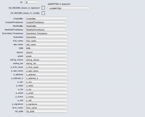
I recommend “importing” the data from the mySQL database into a temporary table. We called ours APPLICANTI_TEMP.  It contains the same exact fields as the mySQL database and it is there so you can identify records in between the two tables. So in my case the fields are text fields, just like in the mySQL DB (even the timestamp). But then we added a timestamp field that is a regular FileMaker TimeStamp and when we run the scripts we set this with the proper FM TimeStamp.


I added two calculations:

  1. One that checks whether the record we are viewing exists in the mySQL table and
  2. Another one that checks whether we have added the record to our APPLICANT table.


Screen Shot 2015-04-15 at 6.45.02 PM


These calculations are quite limited but in my case achieve the wanted result. I am not too worried about someone modifying the records in the mySQL table, because I’m the only one with access to it. But you’ll have to make decisions based on what’s best for you. I, however wanted to make sure I’m not creating the same record several times in the APPLICANT table. Well, we still are, because people apparently fill out and submit the form (sometimes with mismatched information?!?) several times. So at the end of the day you’ll still need a human to identify if a second record has a misspelled last name or it is, indeed a different applicant. But in case you have a scenario that disallows record deletion based on some criteria, you’ll need to develop a more refined logic.


I have already converted my SQL TimeStamp to a FileMaker readable timestamp, but if you don’t do that in your Query you’ll have to do that in FileMaker. Bring Dunning’s Custom Functions collections is always a good place to start looking for handy custom functions.


Screen Shot 2015-04-15 at 7.07.08 PM


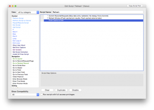
We have a set of scripts that perform the data move (because it’s not really an import). They loop through a set of fields on a layout record by record and create the record in the TEMP table, then the APPLICANT table. These scripts are run from the server every 15 minutes. You set your time interval based on your own process.


The first step is to refresh the data from the mySQL database, because unless you do that any new submissions from the web (in my case) will now show in FileMaker:


Screen Shot 2015-04-15 at 7.10.51 PM


Before running scripts from the server, always make sure you test the hell out of them locally first. Here’s an article on server-side scripts in general. I always recommend adding a LOG table, and put in error checking in your scripts, especially when you’re running them from the server. You DO NOT have a debugger on server. And who wants to code blindly?!


And if you’re lucky—like us—you’ll have to parse the data into different tables, because you’re dealing with parents, addresses and phone numbers. You’d obviously want to do that from the TEMP table record.

Hope this covers it all. Any questions, feel free to ask.

Coding Principles And How They Apply In FileMaker

Coding Principles in general

When I dabbled in development first time I had no idea I actually was developing. I was just adding a few fields here and there. Mostly I just wanted a way to record information on tracking film materials, dubbing, etc. And for the next decade I did the same: I hacked my way to getting things done for the boss. And while I tried to protest, the boss always won and said “but I need it now.” That leaves zero time for planning or building architecture. So I was more of a firefighter than developer. The next decade I spent learning development from scratch and I keep learning.

Simplicity is the most important consideration in a design

Whether you’re a hard core coder who eats, sleeps and breathes code or a school teacher turned FileMaker developer, you sure have some principles that you abide by (and if you don’t you should). We live by principles, so why shouldn’t we code by principles? And when you code, you often ask yourself “is this the best possible way to solve the problem?” In FileMaker there are at least three ways to do the same things. And there’s a different

Since this blog is mostly dedicated to FileMaker development (at this point), I’ll just take a stab at some coding principles and see how they apply to us, FileMaker developers.

YAGNI (You Ain’t Gonna Need It)

The idea is that you should code with the goal in mind to program for what you need not what you might need. XP co-founder Ron Jeffries has written:

“Always implement things when you actually need them, never when you just foresee that you need them.”

The temptation—to create something—is large for a developer. It is like putting a knife in a surgeon’s hand or giving a pencil to the architect; they will want to do what they do best. We want to add bells and whistles and we want to blow the client away. But just like furniture shopping at IKEA, we can end up with a lot more than we can take home. It’s better to code for what the client needs than what the client wants. Personally, I’m an advocate for this and I always tell my clients: “I will give you what you need but not what you want.”

Worse Is Better

Aptly, also called also called “New Jersey style”.  [And if anyone ever wants to mock Jersey, again, they will meet my fist.] The idea behind it is that “quality does not necessarily increase with functionality”.  So what this does is it uses a scale to measure which one is heavier and says simple is heavier than correct. So to me this boils down to getting a solution off the ground and into the users’s hand rather than making it perfect.  You need to cover as many aspects as you can to make it practical. Your design needs to be consistent but simple. So, buttons, element placement and font sizing should be consistent from layout to layout. Luckily we have FileMaker 13 now so if you use a built-in template (or build your own)it’s hard to go wrong.

KISS (Keep It Simple Stupid) principle

This acronym is a design principle noted by the U.S. Navy. Achieving simplicity should be the goal at all times, and avoid unnecessary complexity. Design your layouts with fewer buttons and make sure they do the most important functions. Then you can take the user to a different tab or layout to give them further info. Give them a drop-down menu with further options if you must.

Don’t repeat yourself (DRY)

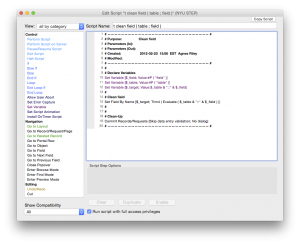
When FileMaker gave us variables, it became possible to start writing universal scripts. If you’re still not using variables you’re missing out on something great! They allow you to compact your code. You can write one script to create, delete, modify a record and give parameters to tell what layout you are coming from, what your table is, where you need to end up when you’re done. Of course, there will be variations which you can put in an if statement if you need it. But if you can create something once and reuse it, you’re golden. Below is a script we use to strip fields (after a user adds data that) from unnecessary garbage.


clean-field-script

Clean Field Universal Script


More useful coding principles: Wikipedia

Converting Files to FileMaker Pro 12

As you may know by now FileMaker 12 is out. A lot of articles have been written about the various features, so I’m not going to bore you with that. FileMaker 12 for iOS is free, so if you haven’t grabbed a copy, go get it. It comes with some demo files to play with to learn about the new features.

With every new release the question comes up: should I wait or should I convert? I think this question should be answered separately whether you’re a developer or a user. Users tend to jump in a lot faster. I have users who just announced they converted their database. Once it’s done—and you start using the database— it’s hard to go back. Developers I talked to are wary about converting, so we have two different groups with one goal: data integrity, however, their patience levels are different.

FileMaker Pro 12 can directly convert your existing FileMaker Pro 11, 10, 9, 8 and 7 databases.  All other versions of FileMaker Pro will require a multiple product conversion.  Review the information below to determine whether your files will directly convert to FileMaker Pro 12, or if they will need to be converted multiple times.

More info can be found in the FileMaker KnowledgeBase.

So, before jumping in, let’s look at a couple of things.

If You Are A User

First and foremost discuss the conversion process with your developer, if you have one. It’s a new file format, you’ll need to upgrade the server, as well as the file(s). If you don’t have a developer, take a look at your dataset. I heard complaints about issues with scrolling in list view. This may not affect you if you don’t use list view, but it’s worth knowing. I, for one, never use list view in the solutions I develop. I use portals that can be filtered in many ways instead, so you don’t have to work with large sets of data at any given time.

Take a moment to consider how mission-critical your solution is. If you’re a small shop (couple of people) with a one-file solution you may be able to just jump in and bite the bullet. You may never have any issues. And you may love a lot of the new features FileMaker 12 offers including the new layout themes. I’d still make a copy of the new database and run FileMaker 12 parallel to your FileMaker 11 (yes you can) and test the new database for a good couple of days. Run scripts, create records, check the mission-critical processes.

If you’re a larger shop or your database is mission critical, I’d take a copy of the file, convert it, put it in a test environment. Put in on a new server (different machine than your FileMaker 11 server). Test your new database thoroughly for about a week. Test systematically. Test for as many processes you can.

If You Are A Developer

Then it is your duty and responsibility to manage client expectations and not let them commit suicide. The same applies to you as the large shops who have a test environment and can perform lots of tests. But you also need to consider that FieMaker 12 has changes that affect the developer, as well. One example the new layout tools. Test the development features, as well, to make sure you will be comfortable developing on the new version.

We’ve been waiting awhile for FileMaker 12 and we are all excited. I love the new Insert from URL function, for example, but  when I developed a database for the iPad for a client, I noticed that getting XML takes 5 minutes on an iPad2 in FileMaker 12. This is not a concern for my client, I believe, but it can be a concern for more mission-critical environments.

It’s possibly best to convert, while your users are not using the database. A weekend might be a good time if you can’t set up a test environment. But as you know, we have 4 weekends in a month, so don’t schedule more conversions than you can handle.

Talk to us, if you need help converting your FileMaker files or have questions about development.

NJ FileMaker Developer Group Meeting Recap: GoDraw – 03-28-12

Another great session at Essex Computer in Paramus.

We had the pleasure of having Todd Geist from Geist Interactive remotely demoing GoDraw.

Todd always blows me away. He is unbelievably smart with a keen eye to design producing highly, sought-after solutions for FileMaker, such as telephony integration or GoSign to name a couple.

The brand new solution, GoDraw enables users to draw on an image in FileMaker Go. It is amazing and we’ve long waited for such a solution.

The use cases are endless:

  • Emergency response: Take pictures at a crash site. Now you can mark them up.
  • Delivery service: broken package can be marked with exact damage location.
  • Architects: take a photo at a site. Add your own doodle to show what the building would look like with another floor.

mazing and we’ve long waited for such a solution.

You can draw on a plain canvas of different colors or use an image (from camera or gallery) and draw on it with different colors and stroke sizes. You can even switch modes to erase part of your drawing. Once you save it, it will be accessible from FileMaker Pro on a desktop. You just can’t modify it from the desktop and re-save it. You can however, always make changes from FileMaker Go at a later time. The image and the doodle are saved as separate layers.

We saw how easy it is to integrate GoDraw into your own solution. It took Todd about 10 minutes to do it live. All you need to do is import some assets from the starter file (table and data), import a script, place a webviewer on a layout, set up a relationship and hook everything up. You can even dig in deeper to modify the settings, such as change canvas size and colors.

If you need help integrating GoDraw in your solution, we’re here to help, contact us.

The Lite version is free. 5-user license at $149, site license $249. It’s really affordable.

Tip:

We learned from Todd yesterday that you can import a whole table from one FileMaker database to another:

Todd will be giving two great sessions at the upcoming FileMaker Developer Conference: one about writing portable code (one of my favorite topics) and another one about useful techniques such as using unique IDs, how to give users access to their own data only, etc.

Differences Between FileMaker And Excel

Everyone I know is familiar with Microsoft Excel to some extent. Some people are more well-versed than others and can do complex data management. Not long ago I met with a consulting company who is working with one of the largest companies in the country to install hardware nation-wide.

The original process is so cumbersome that they now have a lot of things fall through the crack. By the time an order goes through the myriads of departments and processes, the requirements change and the parts required, as well. But the warehouse doesn’t know how to handle that. So they called in a consultant to help. The consultant doesn’t know FileMaker, so they created a giant web of Excel sheets that actually do a really nice job at filling in the gaps and getting the orders straightened out. FileMaker could’ve given them reports and live dashboard so they can see which orders have mismatched elements or which orders need to be fulfilled in the near future. But at this point they invested quite a lot in Excel, so I doubt they will have the time and energy to redo it in FileMaker.

To those who have not put too much effort into Excel or finding it cumbersome to manage their day-to-day activities, the below will give some incentives to use FileMaker instead of Excel to manage contacts, products, inventory, documents, and events. Contact us if you need help deciding. Learn more about FileMaker development.

Strengths of a spreadsheet

  • Storing and analyzing data in lists
  • Analyzing and modeling data
  • Producing charts and graphs
  • Building a financial model
  • Creating basic reports
  • Controlling who can open or modify a file

Strengths of a FileMaker database

  • Viewing information in list, form, or table view
  • Storing and managing virtually any type of information (words, images, numbers, files and more)
  • Creating and publishing customized forms and reports
  • Connecting related information such as inventory and sales
  • Connecting to and from websites
  • Access by multiple people at the same time
  • Mobile access through FileMaker Go or web
  • Set up recurring imports from Excel

Tip:

Use FileMaker to normalize data headers in Excel. This past weekend I was working on my new web store (ssh!) and I had to export/import products. When importing into the new system I encountered an error: “data headers are duplicated”. Well, I looked through the header row in Excel and I couldn’t see anything duplicated, but when you have a lot of columns you shouldn’t rely on your eyes. I did a quick web search and I couldn’t find an easy method to figure this out. Then I realized, why not use FileMaker? So, I quickly converted my Excel sheet to a FileMaker database (drag and drop) and I had all the fields and data in FileMaker. Clearly, FileMaker didn’t have an issue with the fields, so there was no duplication; the web app lied. So, even though I was back to square one, I figured the web app might not like the file format of the CSV file I was trying to import. So I converted it to another format (Windows of all things) and the import went through just fine. Moral of the story: I could’ve spent more time trying to figure out  how to get rid of the non-existent duplicated headers in Excel. But instead, I called FileMaker to the rescue, and it solved my problem in 2 seconds.


UI Design – 10 Tips For Excellent UI Design (And Not Just for FileMaker!)

We can all agree on one thing: Apple knows design. The reason why Apple’s design is excellent is because it’s minimalistic and draws the users’ eyes to what needs to be seen and hides the rest.

A perfect example is the aluminum keyboard:

  • size: as small as physically possible for average fingers to type on;
  • key height: as shallow as possible for a good rebound effect;
  • the USB ports are hidden under the keyboard.

Follow the Universe. The stop sign is a universal symbol. Can you imagine if NYC decided to swap them out in hot pink and the shape of a triangle? You’d have cars piled up at every intersection. Of course, in a database we cannot cause traffic accidents, yet still it is important to pay attention to some design principles.

Quality itself is not enough. Some cultures have always paid attention to design and some took awhile to catch up. I remember how I hated the the style of the former Soviet Union while growing up in socialist Hungary. Every product that entered our country from them was large, boxy and durable, but hard on the eyes and hands. On the other hand, leave it to the Danish or the Swedes and you are guaranteed your product will be carefully designed.

“Even though design is not the most important thing, at the end of the day we are looking at this thing all day long,” said a possible client to me about their current design.

A good designer always looks at the interface from the user’s standpoint, not their own. It is always easier to slap on two more buttons, pick a color quickly and be done. But will those buttons fit in your theme? Do you have a theme at all? Web development has changed drastically over the last decade. Barely anyone uses Flash anymore, and people realized that you don’t need to have every color on the horizon on one screen. FileMaker shouldn’t be any different. A database, actually, gets a lot more screen time than any website, so it really should be paid attention to.

I just was faced with the UI below and even though I’m a designer/developer, I couldn’t figure out how to use this service. My initial thought was I must be stupid and/or getting old. Then it hit me that this experience is not my fault. A good interface is about not having to write a lengthy manual just to find the start button.

I’d like to give some pointers to new and old developers alike on some key details to pay attention to. Your users will thank you for it.

Design your theme

Don’t just start plunking elements on a layout. Or even if you had to do that last week (because your boss put a gun against your head and said you will have to put 23 more buttons there), take some time this week and visualize your user interface. Think about why the user needs to be there in the first place and what they need to see. Resourcehttps://kuler.adobe.com or https://filemakerthemes.com. Kuler even has an option to upload your image (client logo, brochure) and build your color theme from it.

Design for the appropriate screen size/resolution

Ask your client: what screen sizes/resolutions do you have? Are you on Mac or Windows or both? If you have a mixed screen environment, you have to design for the smallest screen, and extend everything from there. You can always extend white space, but if you start too large, they will have to scroll left and right or up and down to see their data.

Be minimalistic

Show interface controls on demand. If there is something you can hide, hide it. The user can always get to it later. If you overwhelm them, they will feel like a kid lost at Grand Central Station. There are plug-ins you can use for this. Resourcehttps://filemaker-plugins.com.

Minimize travel time

Isn’t it great that we have www.hopstop.com now with so many cities that we can choose routes with fewer transfers? Try to think of a way to get your users from point A to B in the least amount of time. Try to get as much information into one dialog as you can so they can choose what they need and move on.

Don’t abuse color

Choose 2-3 colors that complement each other. When in doubt, it’s always a good idea to use shades. You can never go wrong with black and white and shades of gray or another color.

Draw the users’ eyes to what they need

If you’ve seen heatmaps of web interfaces, you know that most people look from left to right and tend to ignore elements on the right. Try to put the most important elements on the left side. highlight the record they are viewing. Don’t reinvent the wheel, because you’ll just throw your users off and make them frustrated.

Use appropriate font sizes

Some things need to be in large font or bold (names, phone numbers, invoice totals). Make an executive decision and highlight the most important details.

Use appropriate font faces

Helvetica is an excellent font. If you want to go crazy, you can always mix 2-3 fonts, but no more. Verdana was meant for web design, and even for the web we don’t have to use it anymore. Note:  Some fonts render differently on Windows.

Display help and informational messages

Tooltips are built into FileMaker. Use them to give your users more info to minimize travel time. You can be creative with tooltips. You can use a tooltip on a contact to show:

  • more contact info;
  • whether they owe your client any money;
  • the information on their latest orders, etc.

Replace FileMaker notification messages with your own

A nicely worded error message in proper English is that says “Unfortunately, there were no records found. Would you like to do a new search?” is much more welcome than a plain old “No records match this find criteria.” It’s even more important to provide proper feedback in more complex situations so your user always knows why something didn’t happen. Another example: if you export reports to the desktop, name them with what the report is about and give the user a note at the end that the report was indeed created and this is what it’s called. Finding a document called “untitled” is very taxing for busy executives.

Conclusion

When combined with a clear focus on how the user is expected to interact with your product, the above tips and tricks work hand-in-hand to deliver something that’s not only good-looking, but usable. We can look to Apple as a leader in setting the standard for great design, but they’re not the only company that has design and usability as guiding principles for much of what they build. The excerpt below is from Smashing Magazine, and is what I’ll conclude with:

Similarly, the minimalist interface of the Google search engine manages to fully accomplish its objectives without getting in your way. The interface disappears, letting you focus on getting things done.

Steve Jobs once said, “design is not just what it looks like and feels like. Design is how it works.” In fact, the usability and overall usefulness of an app is governed by how well it performs its functions and how easily those functions are accessed. Design with a goal in mind — a goal that the interface helps your users achieve. Not every technique will work in every situation or for every application. Only implement interface elements if they make sense in your particular context. / Smashing Magazine