Differences Between FileMaker And Excel

Everyone I know is familiar with Microsoft Excel to some extent. Some people are more well-versed than others and can do complex data management. Not long ago I met with a consulting company who is working with one of the largest companies in the country to install hardware nation-wide.

The original process is so cumbersome that they now have a lot of things fall through the crack. By the time an order goes through the myriads of departments and processes, the requirements change and the parts required, as well. But the warehouse doesn’t know how to handle that. So they called in a consultant to help. The consultant doesn’t know FileMaker, so they created a giant web of Excel sheets that actually do a really nice job at filling in the gaps and getting the orders straightened out. FileMaker could’ve given them reports and live dashboard so they can see which orders have mismatched elements or which orders need to be fulfilled in the near future. But at this point they invested quite a lot in Excel, so I doubt they will have the time and energy to redo it in FileMaker.

To those who have not put too much effort into Excel or finding it cumbersome to manage their day-to-day activities, the below will give some incentives to use FileMaker instead of Excel to manage contacts, products, inventory, documents, and events. Contact us if you need help deciding. Learn more about FileMaker development.

Strengths of a spreadsheet

  • Storing and analyzing data in lists
  • Analyzing and modeling data
  • Producing charts and graphs
  • Building a financial model
  • Creating basic reports
  • Controlling who can open or modify a file

Strengths of a FileMaker database

  • Viewing information in list, form, or table view
  • Storing and managing virtually any type of information (words, images, numbers, files and more)
  • Creating and publishing customized forms and reports
  • Connecting related information such as inventory and sales
  • Connecting to and from websites
  • Access by multiple people at the same time
  • Mobile access through FileMaker Go or web
  • Set up recurring imports from Excel

Tip:

Use FileMaker to normalize data headers in Excel. This past weekend I was working on my new web store (ssh!) and I had to export/import products. When importing into the new system I encountered an error: “data headers are duplicated”. Well, I looked through the header row in Excel and I couldn’t see anything duplicated, but when you have a lot of columns you shouldn’t rely on your eyes. I did a quick web search and I couldn’t find an easy method to figure this out. Then I realized, why not use FileMaker? So, I quickly converted my Excel sheet to a FileMaker database (drag and drop) and I had all the fields and data in FileMaker. Clearly, FileMaker didn’t have an issue with the fields, so there was no duplication; the web app lied. So, even though I was back to square one, I figured the web app might not like the file format of the CSV file I was trying to import. So I converted it to another format (Windows of all things) and the import went through just fine. Moral of the story: I could’ve spent more time trying to figure out  how to get rid of the non-existent duplicated headers in Excel. But instead, I called FileMaker to the rescue, and it solved my problem in 2 seconds.


UI Design – 10 Tips For Excellent UI Design (And Not Just for FileMaker!)

We can all agree on one thing: Apple knows design. The reason why Apple’s design is excellent is because it’s minimalistic and draws the users’ eyes to what needs to be seen and hides the rest.

A perfect example is the aluminum keyboard:

  • size: as small as physically possible for average fingers to type on;
  • key height: as shallow as possible for a good rebound effect;
  • the USB ports are hidden under the keyboard.

Follow the Universe. The stop sign is a universal symbol. Can you imagine if NYC decided to swap them out in hot pink and the shape of a triangle? You’d have cars piled up at every intersection. Of course, in a database we cannot cause traffic accidents, yet still it is important to pay attention to some design principles.

Quality itself is not enough. Some cultures have always paid attention to design and some took awhile to catch up. I remember how I hated the the style of the former Soviet Union while growing up in socialist Hungary. Every product that entered our country from them was large, boxy and durable, but hard on the eyes and hands. On the other hand, leave it to the Danish or the Swedes and you are guaranteed your product will be carefully designed.

“Even though design is not the most important thing, at the end of the day we are looking at this thing all day long,” said a possible client to me about their current design.

A good designer always looks at the interface from the user’s standpoint, not their own. It is always easier to slap on two more buttons, pick a color quickly and be done. But will those buttons fit in your theme? Do you have a theme at all? Web development has changed drastically over the last decade. Barely anyone uses Flash anymore, and people realized that you don’t need to have every color on the horizon on one screen. FileMaker shouldn’t be any different. A database, actually, gets a lot more screen time than any website, so it really should be paid attention to.

I just was faced with the UI below and even though I’m a designer/developer, I couldn’t figure out how to use this service. My initial thought was I must be stupid and/or getting old. Then it hit me that this experience is not my fault. A good interface is about not having to write a lengthy manual just to find the start button.

I’d like to give some pointers to new and old developers alike on some key details to pay attention to. Your users will thank you for it.

Design your theme

Don’t just start plunking elements on a layout. Or even if you had to do that last week (because your boss put a gun against your head and said you will have to put 23 more buttons there), take some time this week and visualize your user interface. Think about why the user needs to be there in the first place and what they need to see. Resourcehttps://kuler.adobe.com or https://filemakerthemes.com. Kuler even has an option to upload your image (client logo, brochure) and build your color theme from it.

Design for the appropriate screen size/resolution

Ask your client: what screen sizes/resolutions do you have? Are you on Mac or Windows or both? If you have a mixed screen environment, you have to design for the smallest screen, and extend everything from there. You can always extend white space, but if you start too large, they will have to scroll left and right or up and down to see their data.

Be minimalistic

Show interface controls on demand. If there is something you can hide, hide it. The user can always get to it later. If you overwhelm them, they will feel like a kid lost at Grand Central Station. There are plug-ins you can use for this. Resourcehttps://filemaker-plugins.com.

Minimize travel time

Isn’t it great that we have www.hopstop.com now with so many cities that we can choose routes with fewer transfers? Try to think of a way to get your users from point A to B in the least amount of time. Try to get as much information into one dialog as you can so they can choose what they need and move on.

Don’t abuse color

Choose 2-3 colors that complement each other. When in doubt, it’s always a good idea to use shades. You can never go wrong with black and white and shades of gray or another color.

Draw the users’ eyes to what they need

If you’ve seen heatmaps of web interfaces, you know that most people look from left to right and tend to ignore elements on the right. Try to put the most important elements on the left side. highlight the record they are viewing. Don’t reinvent the wheel, because you’ll just throw your users off and make them frustrated.

Use appropriate font sizes

Some things need to be in large font or bold (names, phone numbers, invoice totals). Make an executive decision and highlight the most important details.

Use appropriate font faces

Helvetica is an excellent font. If you want to go crazy, you can always mix 2-3 fonts, but no more. Verdana was meant for web design, and even for the web we don’t have to use it anymore. Note:  Some fonts render differently on Windows.

Display help and informational messages

Tooltips are built into FileMaker. Use them to give your users more info to minimize travel time. You can be creative with tooltips. You can use a tooltip on a contact to show:

  • more contact info;
  • whether they owe your client any money;
  • the information on their latest orders, etc.

Replace FileMaker notification messages with your own

A nicely worded error message in proper English is that says “Unfortunately, there were no records found. Would you like to do a new search?” is much more welcome than a plain old “No records match this find criteria.” It’s even more important to provide proper feedback in more complex situations so your user always knows why something didn’t happen. Another example: if you export reports to the desktop, name them with what the report is about and give the user a note at the end that the report was indeed created and this is what it’s called. Finding a document called “untitled” is very taxing for busy executives.

Conclusion

When combined with a clear focus on how the user is expected to interact with your product, the above tips and tricks work hand-in-hand to deliver something that’s not only good-looking, but usable. We can look to Apple as a leader in setting the standard for great design, but they’re not the only company that has design and usability as guiding principles for much of what they build. The excerpt below is from Smashing Magazine, and is what I’ll conclude with:

Similarly, the minimalist interface of the Google search engine manages to fully accomplish its objectives without getting in your way. The interface disappears, letting you focus on getting things done.

Steve Jobs once said, “design is not just what it looks like and feels like. Design is how it works.” In fact, the usability and overall usefulness of an app is governed by how well it performs its functions and how easily those functions are accessed. Design with a goal in mind — a goal that the interface helps your users achieve. Not every technique will work in every situation or for every application. Only implement interface elements if they make sense in your particular context. / Smashing Magazine

How To Hire A Consultant

Why would you want to spend time reading this article instead of just hopping on the phone and calling people? Because it can hopefully save you time. And if you are a small business owner—just like I am—you care about your time because it costs you money.

For us to communicate efficiently, I’d like to give you a couple of tips on getting ready for your first phone call with us (or any design and development firm for the matter).

Visit Our Website

Spend some time browsing our website, take a look at our portfolio to learn about previous work, read some blog posts, learn about our feature set.

Build A List of Features

Whether you are starting from scratch, want a new website or want to add some features to your existing database, knowing your feature set is important. No need to go crazy just put together a bullet list of features.

Build A List of Business Problems

Jot down—in the order of priority—the business problems you are trying to solve by getting a new system or making modifications to the old one.

Some examples would be:

  • you cannot access your contact list when you’re on the road;
  • you cannot see your latest sales of the day or how much you sold altogether;
  • you cannot see the profit margin you have;
  • you cannot access your inventory database from the warehouse;
  • you have a lot of Excel sheets and they are not ‘talking’ to each other.
Find Some Examples

It’s beneficial to find some examples of work, navigation or theme you like. Create a sublist with comments  for those (likes and dislikes).

Jot Down Some Questions

Just like at a job interview, goot to be prepared to ask some questions. Some questions might be:

  • “Do you charge for discovery”;
  • “How does the process work”?;
  • “What is your availability”?;
  • “How much involvement does the process require from my company”?;
  • “Any references I can call”?

Then when you do get on the phone you will feel empowered and you can drive the conversation.

We are here to take your business to the next level.


FileMaker Image Management – Container Field Behavior and Much More

One of my clients called this week and told me his logo got inverted when printing to a PDF. Also, the PDF file size doubled. Previously it did not occur to me to check the file he received from his designer, because I wrongfully assumed the designer gave him the appropriate file. But this brings up some interesting points about what files we should use with FileMaker and how we should use them. So, I gathered some useful information. Hope this helps you with handing your images in FileMaker and FileMaker Go.

General Image Handling

There are several different ways you can show images on a FileMaker layout:

  • Container field (Insert/Picture)
  • Place image on the layout (copy and paste from another source)
  • Show from another source in a webviewer (i.e. using SuperContainer or DocuBin)

1. Container Field

Advantages:

  1. Quick and easy. You insert an image, and voila it’s right there. If you store the file as a reference only  (suggested use if you have constant access to the hard drive the files reside on and do not plan to move or delete them) you will not bloat your database;
  2. Anyone can export it from there by right-clicking on the image and choosing “Export Field Contents”;
  3. The image can be swapped out just by inserting another image;
  4. Scan directly into a container field (by using a plug-in);
  5. You can export or email the image (file) as an attachment;
  6. Images can be cropped or resized (pay attention to maintaining proportion).

Disadvantages:

  1. You cannot do too much manipulation without a plug-in;
  2. Your database file size gets large by every image you inserted (unless stored as a reference only), therefore eventually your database will get slower;
  3. Global container fields save on close, so your file must be accessed locally, if you’d like to save a change;
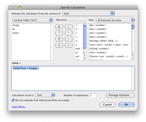
  4. You can’t find or sort records, so you need to set up a calc field. See Exhibit A;
  5. You can only print the image as it is on the layout.

2. Place Image on Layout: Placing an image on the layout is not generally a good idea, unless it is your logo or  layout design (i.e. you are creating a header), but even so it’s best to use a global container field in an interface table or an image table where you load the images from when your database starts. Although, I have to mention that I see image quality differences between a referenced image in a field vs. an image pasted on the layout: in my opinion, image quality of the pasted image will be superior.

3 . Web Viewer

  • Web viewers are great for images. You can show images from a website or SuperContainer. PDF (and certain image*) files can be viewed from a web viewer. PDFs can even be manipulated (zoom, next page, etc.) on Macs. Files are not stored in the FileMaker database.
  • You cannot print from the web viewer.  You can print the layout, but that’s agains, any decent designer’s instincts.
  • There’s a great article by Geoff Coffey on Scaling Images in a Web Viewer.

Instant Web Publishing

  • Container field data cannot be entered or modified from IWP.
  • Complex or layered pictures are not rendered properly.
  • SuperContainer works with IWP.

Image Management Helpers (Plug-Ins and Tools)

  • SuperContainer (File and image management. The images are NOT stored in the FileMaker database, rather stored on a file server (can be your local computer). Has the ability to upload/download, version files.
  • CNS Image (An all-round plug-in for image handling.)
  • InsideScan (Scan directly into a container field.)
  • ExifPlugIn (Get EXIF data from pictures taken with a camera.)
  • ScriptMaster (Has basic functions for cropping, rotating, watermarking, etc.)
  • Theme Library (Themes, buttons, image manipulation)

Supported Formats for Container Fields

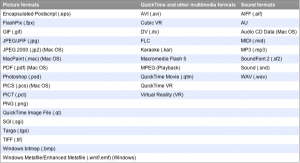
FileMaker Pro supports the following picture, QuickTime, and sound formats (Exhibit B)

FileMaker Supported Image Formats

General Image Suggestions

Print Quality: 300 DPI CMYK or Grayscale JPG or TIFF (if you need large, good-quality photos)

Screen Quality: 75 DPI RGB or B&W

Transparency: If you plan to use transparency, FileMaker suggests using TIFF, PNG, or JPG images. FileMaker does not recommend using the PICT (.pct) format with transparency.)

Caveats: For proper image handling, QuickTime installation is suggested on Windows.

Image Resizing and Cropping

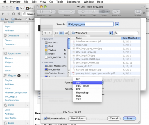
The Preview app on Mac OS X can manipulate images: you can crop, resize, even convert them to a different format (JPG, GIF, PNG, TIFF, etc.) (Exhibit C).  Some plug-ins and the Theme Library can enhance your image manipulation experience.

Image Resizing in Preview

FileMaker Go

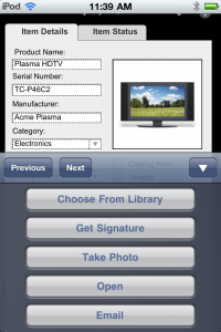
FileMaker Go has now the following functions for container fields (Exhibit D):

  • Choose From Library
  • Take Photo  (iOS device with camera required)
  • Get Signature
  • Paste
  • Open
  • Email

Container Field Options on FileMaker Go

SuperContainer works with FileMaker Go without programming changes. Because SuperContainer thumbnail file sizes are a tiny fraction of the full-size images, they load much faster, especially over a 3G connection.

* You can view any image that your browser (Safari on Mac and Internet Explorer on Windows) supports.


What QR Codes (2D Barcodes) Are – And Their Uses For Your Business

Have you seen one of these square garbled-looking images before? You may have seen them on a subway poster or at an airline boarding pass or on mailers. This article will give you a little background on what they are and how they can be useful to you and your company.

What is a QR Code?

QR code (abbreviation for Quick Response code) is a specific matrix barcode (or two-dimensional code) that is readable by dedicated QR barcode readers and camera telephones. The code consists of black modules arranged in a square pattern on a white background. The information encoded may be text, URL, or other data. [Wikipedia]

According to Wikipedia,

the technology has seen frequent use in Japan, The Netherlands and South Korea, while the West has been slower in the adoption of QR codes.

I got a box of KitKat last summer from Japan (thanks, Shin) that had a QR code on it. It’s slowly but surely picking up on the East Coast, as well. E.g. BJs and other companies are using them on their savings cards.

Barcodes vs. QR-Codes

Barcode

Picture of a Traditional Barcode

QR-Codes have become more popular than the typical barcode as the typical barcode can only hold about of 20 digits, whereas the QR-Code can hold up to 7,089 characters. This makes the use and diversity of QR-Codes much more appealing than their older counter part, the barcode.

Partially part of the reason QR-Codes can hold more data, is because if you compare a typical barcode to a QR-Code, you can see one major difference; barcodes only span horizontally whereas QR-Codes can span both horizontally and vertically.

Position

A great feature of QR-Codes is that you do not need to scan them from one particular angle. QR-Codes are capable of omnidirectional (360 degree’s) high-speed reading. QR-Codes scanners are capable of determining the correct way to decode the content within the QR-Code due to the three specific squares that are positioned in the corners of the symbol.

QR-Code scanner uses three corners as markers, regardless of pistion scanned

Generating QR Codes

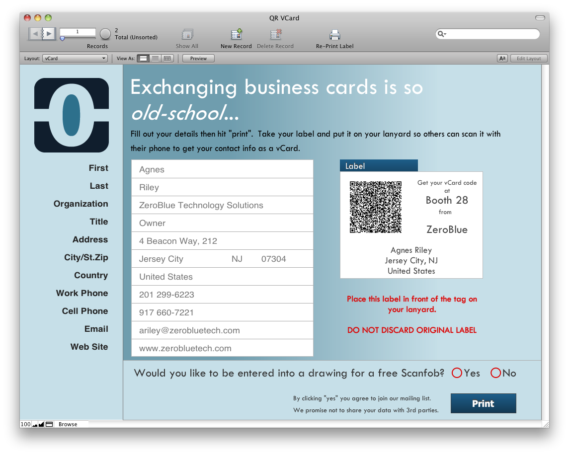
There are a number of web sites for generating QR codes and most services they offer for free. You can also generate QR Codes with Google Charts or right in a FileMaker database, which we will demo at Devcon. The demo database uses the ScriptMaster plug-in from 360 Works and some java goodies put to use by Scott Shackelford at AEON Development Group.

Here’s a great article from Mashable on how you can make your QR codes more appealing like this. Make sure you pay attention that your code is still readable.

blue qr image

Uses for QR Codes

The uses are only limited by your imagination, but let me give you some ideas:

QR Codes can be used:

  • On your business card (vCard);
  • Your brochures and other marketing materials;
  • The sides of trucks and trailers;
  • Product tags and packaging;
  • Convention and event nametags;
  • Restaurant menus;
  • Event ticket stubs;
  • Point-of-sale receipts, etc.

Reading QR Codes:

There are several apps for smartphones that can read QR Codes. Barcode Scanner for Android and QR Reader for iPhone and iPod Touch (with camera).
QR Codes could link to:

  • Installation instructions
  • Contact information
  • Sources for replacement parts and service
  • Map and directions to your business
  • Coupons and special offers
  • Free software downloads
  • Customer feedback forms

ZeroBlue offers two Bluetooth 2D scanners:

  1. Koamtac KCD 300
  2. Socket CHS 7X

Both scanners work with 1D barcodes, as well. The Socket scanner is also ruggedized; withstands multiple 5-foot drops to concrete. Dust, shock, and water-resistant.

If you’d like to implement QR code printing or scanning in your business contact us.

Software Development Life Cycles in the FileMaker Development Arena

Software development life cycles are well understood in the industry. However, most of our clients are from fields completely unrelated to software production. With this article I aim to give the prospective client a little insight into how the process works and why we charge for creating an estimate.

I have some friends who are architects. We talk shop sometimes and the more I talk to them the more I realize our industries are actually very similar, I just don’t have to get the large liability insurance. The process of building a house is very similar to the process of building a database: you have phases in which you accomplish different tasks, with each phase building upon the one that preceded it. The end product should be the result of specifications established throughout the planning and design phases.

Custom development generally has the following phases:

  1. Analysis
  2. Specification Building
  3. Design and Development
  4. Testing and bug fixes
  5. User Acceptance Testing
  6. Maintenance

Most clients are happy to pay for step 3. The other 5 steps are the ugly stepchildren. They are, however also an integral part of software development.

Let’s go back to the house for a second. Has anyone contracted an architect to build something for them or just remodel the kitchen? In this country not a lot of people build from scratch, but where I come from that was a more common way of acquiring a new home. So, think about it, can you realistically approach an architect and say: “I’d like a house to be built, but I’m not willing to pay for the quote, the blueprint, and I shouldn’t even have to come and visit, because you’re the architect, you know what I need, so just build my house.” How many buildings do you think would be built like this? When you are building a house, you have to be part of the process, because it will be YOUR house, not the architect’s. It is your influence that will make that a comfortable home for you. Architects will know the material specifications and how to design and build in general but every building is different, therefore the whole process is different. The same applies to custom software development; it will be YOUR product.

Analysis

When it comes to custom software development, prospective clients who basically just tell me the big picture of their idea and tell me to give them a quote and want to get it built yesterday are more the rule than the exception. Well, guess what? I have no idea how you want your database to function! In the same way, an architect would have no idea how many bedrooms you want, how much storage space you need, or what color you’d like your bathroom to be. Now, these might be minor details, but they surely are important details. Analysis is very important. That is the stage where the clients shows how they work, what problems arise in their daily workflow, and we all work together to tackle those.

Why we charge for analysis?
Because it’s one of the most important stages of your development. Again, back to the architect example: would you want an architect to build your house without a blueprint? No, you don’t (or, at least, you shouldn’t!). Does an architect charge for creation of the blueprint? Yes, they do. And they do because it is a lot of work. You have to gather enough details to be able to draft documents, go over them again and again to be able to come up with a set of requirements to build from.

How much do we charge for analysis?
That depends on the scope of the project. Generally we start with 10 hours, but for larger systems it could easily take 20-30 hours. And yes, the client has to participate. We have meetings (generally held remotely) during which we do some research on your existing tools and process, and learn about the details of your requirements. The end result will be an estimate with low and high numbers of hours for the job along with a plan and schedule for deploying it.

Specifications

This document is the result of the step above. Yes, it takes time (and thus money) to prepare, but in the end it’s to everyone’s benefit that it exists. This is the blueprint that all following phases will adhere to. It defines the scope of the project, clearly lists out requirements that need to be met by the system being built, and lays out how the system will meet each of those requirements. Perhaps more importantly than its technical function, it also serves as a standard both parties review and agree to, so everyone has a clear understanding of what deliverables to expect.

Design and Development

This is the phase in which we build and test all of the code and processes required to satisfy the architecture and design specifications. We build according to the specifications document that we prepared. At this stage deviating from the plan can slow the development down and/or can make it more costly. So by the time we get to building, we should have all screens, processes and reporting needs established.

Testing and Bug Fixes

Once the application has been built, it is time to perform the following tests:

  • System testing (to make sure your server environment is sufficient);
  • Integration testing (if there’s any);
  • Performance testing; and
  • Data load testing.

User Acceptance Testing

This is the stage where the client reviews the delivery to be sure all agreed-upon requirements are met. Think of it as taking a new car out for a test-drive. It’s helpful to write out test cases to plan out how you’ll approach your review and ensure that you have proper tests to match against every requirement in the Specification document. But whether you have a test plan or not, make sure it meets your needs by running it through all the same scenarios that you’d expect it to be able to handle during day-to-day, real world usage. Its performance during your review will give you a clear picture of how it will work once deployed. Once you’re satisfied, acceptance is given, and the product is considered officially delivered.

Maintenance

If you have a car, the maintenance includes regular oil changes, a wash, more air in the tires, amongst other things. A database that is working does not require similar actions, but it’s worth checking the system on occasion: making sure your backups are running and they are not corrupted; creating healthy clones, making sure your server is chugging along nicely, etc. This can be performed by the developer or in some cases, the client themselves.

These are the main phases of development, and we hope you have a better understanding of how the process works. Custom development is just that—custom—and each phase is critical for the creation of a solid product catered specifically to your needs.


Top 10 Suggestions If You Want To Hack At A Database Yourself – For In-house FileMaker Developers

All FileMaker developers start somewhere, and that place is definitely not being a certified independent developer. I started by being an in-house developer. Working in a busy environment, all you have time for is cranking out the features that your boss needs, right away. Nobody has time to think about consequences. My job was to get that report done, no matter how many calculations I had to add so I can produce the results. Or getting that extra layout in so we can show the data on a different list. All of these things add up, and eventually they make your file larger and/or slow your database down.

As an independent developer, you start from a different perspective: data and system integrity are most important. Over the last 4 years since I’ve been developing independently I have learned a lot from fellow FileMaker developers. I had learn to to rethink how I develop and incorporate planning, design, testing and other steps to my routine. It wasn’t so much reinventing the wheel so much as making it better.

One great thing about FileMaker (aside from it being agile) is that anyone can become a developer. If you feel like you have enough skills to create what you need, feel free to get started. You can purchase volume licenses with great discounts even for a small office from us. And if you get in trouble, you can always consult with us during your project or even years later, when you realize that it’s actually far from where it could be.

Here are some conventions to follow if you start on your own. These will help you greatly down the line. Follow @zerobluetech on Twitter to ask questions.

  1. Be minimalistic:

    Create what’s needed, not more but not less. A lot of times we don’t think about the effects of what we do; what’s another calculation, right? Think again. The more calculation fields you have on a layout, the slower the layout loads. We’ve all seen layouts that said “summarizing” for over minutes. This is easily avoidable by storing data in indexed fields.

  2. Break your scripts into smaller chunks.

    Don’t write scripts that would print on several pages. By the time you write it you’ll forget what the beginning was all about.

  3. Follow a naming schema.

    There are a lot of them out there, but you can certainly invent your own. Stick to it.

  4. Comment your code.

    Comment calculations, scripts and even layouts if needed. You (and others) need to know what’s what at a later time, too.

  5. Implement strict security features.

    Steven Blackwell (@filemakersecure) cannot say this enough but people are still not listening. 🙂 If you have strict control over who can access your data, you have a much better chance of avoiding disasters.

  6. Use custom menus for controlling access.

    Take away “delete all records” from all users–then you won’t have to restore thousands of records (and lose the ones that weren’t captured in the last backup).

  7. Talking about backups:

    Back up, back up, back up.  Every 30 minutes or ever hour (depending on your storage space), but at least once a day, week and month. Save clones of your working database. In case database corruption, you can export the data and get it imported to an earlier clone and you’re back in business. Compact the clones to save disk space.

  8. Do not store images in FileMaker container fields.

    Contrary to popular belief, your database will get large and clumsy over time. Use SuperContainer and now DocuBin to manage files.

  9. Stay away from a lot of graphics.

    Do not paste large images on your layouts: they will just slow your database down. Create 75 dpi PNGs if you can. They will also preserve transparency. Or put them into container fields so the dataabse will have to load them once, as opposed to on any layout. Here I’m talking about your layout design (header, buttons), not your records!

  10. Use forums, mailing lists and friends.

    Don’t spend time reinventing the wheel. Someone already did it.

Hope this will save you guys a lot of time. Had anyone broken things down into digestible chunks I certainly would’ve not spent a lot of my evenings at work recovering data other people lost accidentally or rebuilding features because my database got corrupted. Glitches can still happen and they will happen. You can, however reduce the opportunity for things going bad.

You will run into walls, we all do. But don’t be afraid. Start working on something or modify any of the FileMaker starter files.

If you need help, feel free to contact us; we provide consulting services in the New York, New Jersey area, or to any region where screen sharing apps are accepted. First hour of consulting is free.

Also, check out our services, portfolio and products.


NJ FileMaker Developer Group Meeting Recap – 04/27/2011

The evening started with dinner at a lovely Thai restaurant in Ridgewood, NJ, called Malee, where we all had a lively discussion of all non-FileMaker related matters, then we walked over to the Ridgewood Education Center, our regular spot. Jesse Barnum of 360 Works and John Sindelar of Seedcode were our guests to show us some of their latest work. These guys are amazing. Their work is cutting edge, leading the FileMaker industry into the future.


Jesse introduced us to DocuBin, their new document management system that’s based on SuperContainer, what I have been recommending to clients for managing files in FileMaker. SuperContainer comes with it’s server (standalone or Tomcat install) that stores your files that you access from FileMaker, thus keeping your file size down. DocuBin builds onto SuperContainer and takes it a lot further.

DocuBin spots the following features (among many):

Familiar Interface

DocuBin Hierarchy

Navigate your folder structure, then insert, move, and delete just like you would on the desktop.

Favorites & Collections

DocuBin Favorites & Collections

In addition to the standard file hierarchy, Favorites and Collections put the files that are important to you at your fingertips.

Document Previews

DocuBin Previews

Preview a document inside of DocuBin, or open it in the document’s native application.

Version Control

DocuBin Versions

Compare versions of a document to view what has changed.

DocuBin requires SuperContainer that you’ll have to purchase separately, but it does include other plug-ins that you will need to use it.

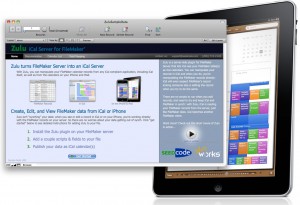
Zulu iCal Server for FileMaker


John Sindelar introduced us to Zulu, that turns your FileMaker server to an iCal server. It lets you manipulate your calendar events from an iOS device, Google Calendar and you see your changes immediately in FileMaker. Zulu is a brilliant addition to your solution if you are on the go (and even if you are not) and would like to take your events with you. Also, if you have someone else is managing your schedule and you just want to see the events, Zulu is for you. You can even manage multiple calendars. Zulu can unleash your creativity and use calendars not just for scheduling but let’s say resource ond team management.


John and Jesse also showed us another goodie they had in their bag: Zulu Contacts. Zulu Contacts lets you sync your contacts between a FileMaker database and your mobile device. This is amazing. Finally, you can share a group of contacts between a team and have all their data be stored in FileMaker, but take them on the road with your iOS device. You can edit a contact on your iPhone on the road and it will sync back to FileMaker.

ZeroBlue offers licensing and implementation for any of the above mentioned products for your organization. Contacts us for details and pricing.


Pause on Error Inspiration – A Mockup for Script Manager

With Pause on Error fast approaching (February 17-18), I realized we are getting closer to Devcon 2011. Of course we are all eager to see what FileMaker Inc. will reveal to us, developers, in the new version of FileMaker pro. How are these things related? Well, Vincenzo Menanno from FMNexus will host a session at Pause : FileMaker User experience for Developers.

I was filled with excitement when I saw his session and since he invited participation, I promised myself, I will create some mockups for his sessions. That didn’t happen. Well, not quite. I’ve been actually really busy with work (no comment), so I just didn’t have time to come up with a lot of ideas and put them into a form worth sharing.

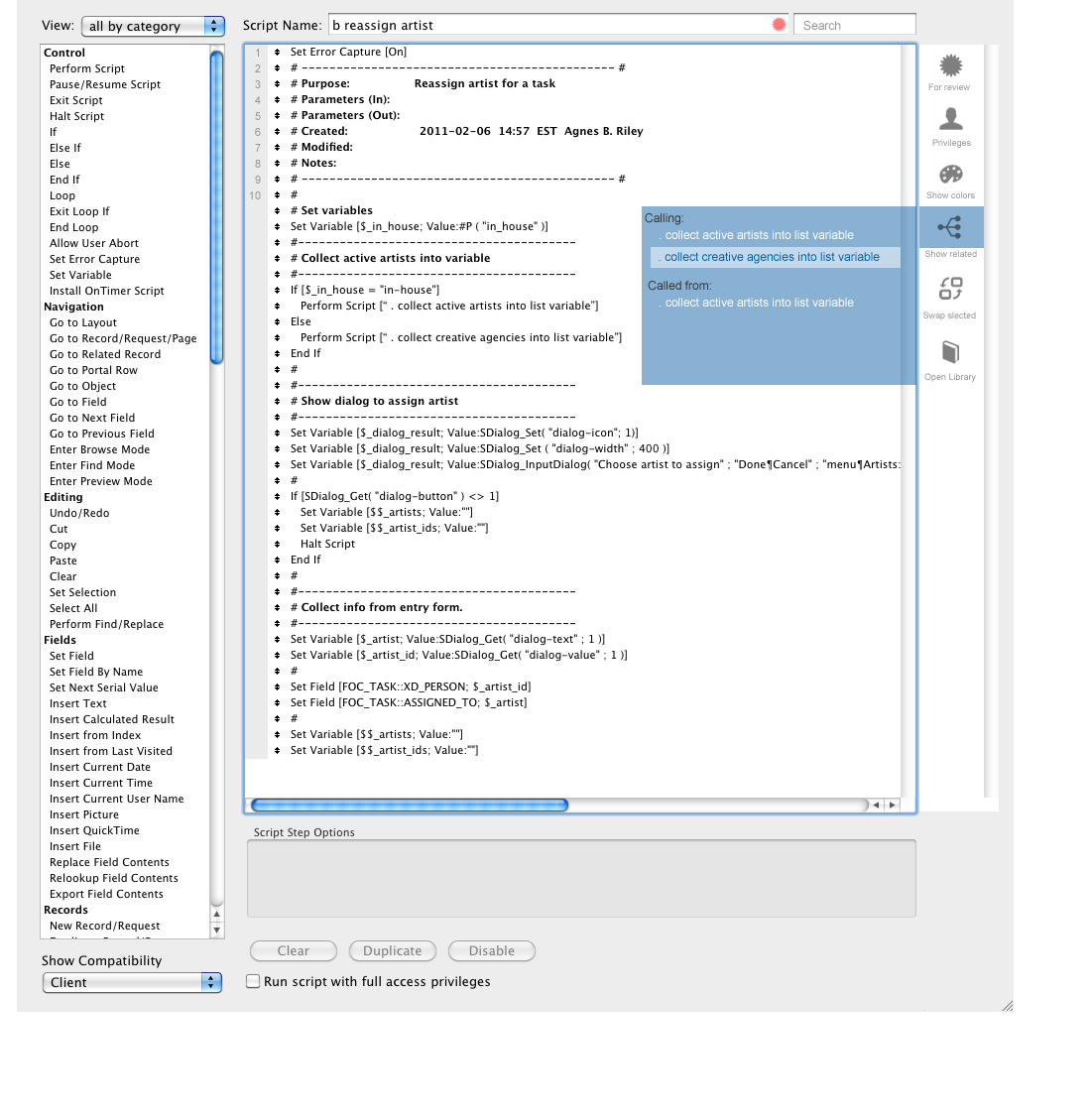
I did, however create one mockup, and that is for the Manage Scripts window. Why that one? Because I simply spend most of my time in it. I try to not use a lot of calculations in my solution to simply keep them light and fast. The more calculations you have the more the FileMaker engine has to process steam and you shall see beach balls. I try to save the beach ball, ahem, for the beach. So joke aside, I really spend a lot of time writing scripts and REALLY wold like to see some improvements here in FileMaker. You see, traditional programming, whether we’re talking PHP for the web or using XCode (or else) has a lot of traditional tools, such as the ability to number lines or even color your lines. I know, FMI is trying to keep FileMaker the same on both platforms (Windows and Mac), but I think it is time that we see this product enter the 21st century arena, where all the other boys have armor.

So, on that note, here’s my mockup. It’s not a genius’ work, but it’s an idea. It’s clearly not finished, I should say I just started. It’s meant to provoke thought and bring more ideas to live, not showcase my abilities of finished design.

The way I imagine this window with an icon bar on the right that should be customizable (just like additional keyboard shortcuts). You should be able to add and remove elements, because we have individual needs.

A little explanation of what you are seeing:

  • For review: easily mark a script that you’re not done with (that shows in the Script list)
  • Privileges: open up the privileges that have access to this script and allow adding/removing
  • Show colors: colors would be predefined for if statements, variables, etc. we could just modify them a bit unilaterally
  • (I think I exhausted that one)
  • Swap two selected script segments (how I wish for this sometimes instead o dragging one then the other)
  • Open Library: Open functions library to add functions to variables faster (think of other possibilities)